Marginal Printing Profits
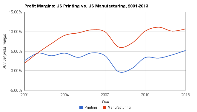
04 Feb 2015I pulled together this graph in the course of researching the competitive position of printing companies. This shows the industry-wide profit margins of the printing sector versus manufacturing as a whole. Looking at this chart feels like a punch to the gut, but explains a lot:
 Click to open interactive graph
On the other hand, I suppose you could look at upward trend in printing over the last three years and also imagine that the worst could be behind us. The Internet happened, and printing has found its bearings in the new landscape. This reminds me of a New York Times article that I enjoyed last week, describing the renaissance of the printed catalog. I wonder if the shifts in the industry towards marginally higher profit margins will be enough to pull it out of the cellar over the long term.
Source: US Census Business and Industry Time Series/Time Charts. The percentage is the net income before taxes relative to net sales, receipts, and operating revenues.
